我们再来引入Element Plus,安装并引入的过程如下:
安装:
yarn add element-plus完整引入:
// main.js
...
import ElementPlus from 'element-plus'
import 'element-plus/dist/index.css'
app.use(ElementPlus)
引入后,我们就可以在Vue3项目中使用了:
<template>
    <el-button>按钮</el-button>
</template>
Element Plus使用Icon会比Element UI稍微麻烦点。首先我们需要安装Icon的依赖:
yarn add @element-plus/icons-vue我们在main.js中注册所有的图标,当然也可以按需引入图标:
// main.js
// 全局引入
import * as ElementPlusIconsVue from '@element-plus/icons-vue'
...
for (const [key, component] of Object.entries(ElementPlusIconsVue)) {
  app.component(key, component)
}el-icon的使用:
<template>
    <el-icon>
        <Edit />
    </el-icon>
</template>
<script setup>
// import {Edit} from '@element-plus/icons-vue' // 按需引入,如果已经全局引入了就不需要按需引入
</script>
Element Plus的el-icon使用的是svg,这与Element UI使用的类名有很大的不同,也就是说我们无法直接在el-icon中使用iconfont的图标。虽然Element Plus的图标已经能满足大部分场景的需求,但是==一些特殊场景只能从iconfont或者自定义的图标上获取==。
那么有没有办法将iconfont封装成svg,并给el-icon调用呢?
方法一:将iconfont封装成svg
可缩放矢量图形(Scalable Vector Graphics),简称SVG,是一种基于XML的,可用于描述二维的矢量图形。SVG可以优雅而简洁的渲染不同大小的图形,并且可以被无限缩放并且保持不失真或者降低质量,这一特性比JPEG、PNG等好用太多。SVG的内容相当多,感兴趣的可以去MDN上查看文档:SVG。我们这里只是简单实用SVG来封装iconfont。
首先我们新建一个SvgIcon.vue的文件,
<template>
  <svg :class="classList" aria-hidden="true">
    <use :xlink:href="iconName" :fill="color" />
  </svg>
</template>
<script setup>
import { computed } from 'vue';
const props = defineProps({
  className: {
    type: String,
    default: ''
  },
  iconClass: {
    type: String,
    required: true
  },
  color: {
    type: String,
    default: '#409eff'
  },
  size: {
    type: String,
    default: '20px'
  }
})
const classList = computed(() => {
  return ['icon', props.className || '']
})
const iconName = computed(() => {
  return `#${props.iconClass}`
})
</script>
<style scoped>
.icon {
  /* v-bind是Vue3才支持的功能,可以将CSS的值与js的值绑定 */
  width: v-bind('props.size');
  height: v-bind('props.size');
  position: relative;
  vertical-align: -2px;
  fill: currentColor;
}
</style>这样就将iconfont封装成了svg来调用了,这里我们重点说几个属性:
aria-hidden:默认为false,设置为true表示会把整个元素包括子元素从可访问树(AOM)上移除,但是在DOM树上还是存在的xlink:href:use元素的属性v-bind:Vue3的特性,可用于关联CSS和jsfill:如果在动画接收还需要保持动画的值,可用于设置颜色
如何使用
使用已经封装好的SvgIcon.vue比较简单,就和正常的组件一样使用即可。例如:
<template>
    <SvgIcon :icon-class="icon-pointer"></SvgIcon>
</template>
<script setup>
import SvgIcon from './SvgIcon.vue'
</sript>
如果不想在局部注册组件,也可以注册为全局组件:
// main.js
import SvgIcon from '@/SvgIcon.vue'
...
app.component('SvgIcon', SvgIcon);作为SVG组件,我们也可以直接使用在el-icon中,这样就可以添加任意iconfont到el-icon中了:
<template>
    <el-icon>
        <SvgIcon :icon-class="icon-pointer"></SvgIcon>
    </el-icon>
</template>按理说到这里,本篇教程就应该结束了。但是,在使用的过程中,按照正常的方式设置的hover样式不生效,笔者尝试了几种方案,最终放弃hover,采用监听鼠标事件的方式解决。
方法二:自定义SVG组件
根据阿里巴巴矢量图标库iconfont获取方式,我们设计以下几种可行方案:
1)下载为png或者svg图片,将图片导入到我们的项目,引入其路径
2)复制svg代码,将其嵌入到我们的项目,转换为图标元素,通过代码的形式使用
新建Shop.vue,拷贝svg代码
<template>
  <svg t="1735110751450" class="icon" viewBox="0 0 1024 1024" version="1.1" xmlns="http://www.w3.org/2000/svg" p-id="1921" width="200" height="200"><path d="M384 832v85.333333h-85.333333v-85.333333h85.333333z m405.333333 0v85.333333h-85.333333v-85.333333h85.333333zM240.32 185.002667l24.149333 140.928h633.173334L835.285333 746.666667h-563.626666l-85.333334-497.685334H94.485333v-64h145.834667z m583.104 204.928H275.434667L325.632 682.666667h454.464l43.328-292.736z" fill="#1677FF" p-id="1922"></path></svg>
</template>
新建index.js,导出Shop.vue
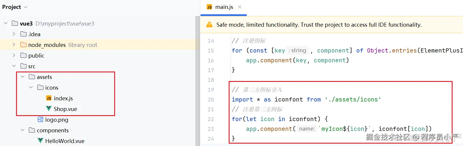
下面的代码中注册了ElementUI默认Icon,也注册了我们自定义的Icon。
import * as ElementPlusIconsVue from '@element-plus/icons-vue'
import type { Component } from 'vue'
import Shop from './Shop.vue'

const components: Record<string, Component> = {
  'my-icon-shop': Shop,
}

export default {
  install: function (Vue: { component: (key: string, component: Component) => void }) {
    Object.keys(components).forEach((key: string) => {
      Vue.component(key, components[key])
    })
    for (const [key, component] of Object.entries(ElementPlusIconsVue)) {
      Vue.component(key, component)
    }
  },
}
也是同样的在main.js中进行注册。
import { createApp } from 'vue'
import icons from '@/assets/icons'

const app = createApp(App)

app
  .use(icons)
  .mount('#app')
使用方式和Element-plus一样,采用代码的方式。
<!--可以直接使用-->
<myIconShop />
<!--搭配el-icon使用-->
<el-icon><my-icon-shop /></el-icon>